The visitor leaves a contact
Chooses how to receive a reply and, optionally, a preferred time.
A doctor’s personal website / Zelenograd / 2026
Then comes the first appointment.
Building a dental surgeon’s website
where people can meet the doctor, understand
their options and take the next step.
01 / The starting point
A list of procedures is not enough when you are choosing a surgeon. You want to know who will see you, whether they will explain things clearly, and how to get started.
Andrey Ivanov has worked in surgical dentistry since 2012 and sees patients in Zelenograd. I set out to build a clear personal website around his practice: introduce the doctor, explain the services and make it easy to get in touch.
On the other side of the screen is the assistant’s daily work. Each enquiry needs attention, each person a reply, and each new review a check. So I built a private dashboard alongside the public pages.
02 / First impressions
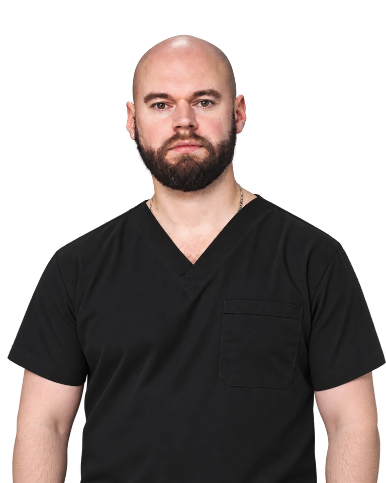
The first screen introduces the person you will meet: his face, name and place of practice.
A warm off-white background, deep green, large headings and plenty of space. I wanted people to feel comfortable taking their time: reading, looking at the photograph and finding the question that brought them here.
The portrait anchors the homepage. The same image appears on service pages, keeping the doctor in view even when someone arrives directly from search.
Photography sets the mood.
Typography makes room for the words.
03 / Content
“Can I have an implant straight after an extraction?” is a good reason to open a page. That is where the conversation starts.
Implants, sinus lifts, bone grafting and complex extractions each have their own page. They explain the procedure, its stages, recovery and questions people may bring to a consultation.
The copy leaves room for individual circumstances. It helps people prepare for a conversation and decide what to ask. An enquiry link is nearby when they are ready.
04 / Inside the website
From a service page to the working dashboard. Switch views and enlarge each screenshot.
Each service has its own URL and content. A visitor can arrive from search at the relevant topic and see who will treat them.
A photograph from the practice continues the introduction. Education, experience and areas of work sit alongside it, helping visitors get to know the specialist before meeting.
Call, use a familiar messenger or leave a contact. There is no patient account to create and no password to remember.
Enquiries, review moderation and content drafts share a single dashboard. Moving between sections does not require another login.
Each card shows the preferred contact method and time. Statuses distinguish a new enquiry from one that has already been handled.
A new review is visible to the administrator first. It can be approved or declined; the author’s contact stays in the private area.
Screenshots were taken in a separate copy. Enquiries and the review are fictional. Notifications are disabled in this copy; no patient records appear in the case study.
05 / On a phone
Someone may share the link in a chat. It opens on a phone, and the first introduction has already begun.
I checked the mobile version separately: the portrait crop, heading breaks, readable descriptions and tappable buttons. Quick contact links stay in the header.
Photographs use lighter versions, and images further down load as needed. The site should answer questions while a visitor is interested, without making them wait for a heavy image.
06 / After the button
Chooses how to receive a reply and, optionally, a preferred time.
Telegram and email receive a notification linking to the dashboard.
Details are available after login. The assistant contacts the person and updates the status.
The request is stored independently of its notification. Failed deliveries can be retried, and the assistant can open the request list in the dashboard.
07 / Feedback
Patients have a dedicated submission form. A review enters moderation, and the administrator receives a notification.
Nothing is published automatically. Contact details allow follow-up questions and do not appear on public cards. An approved review can be unpublished from the same dashboard.
Newly added published reviews appear first. Longer lists are split into pages, keeping the section manageable.
08 / The finishing work
After launch, we kept opening the site on a phone, reading the forms and noticing things that a first mockup does not reveal.
“Read more” links gained a visible underline. Symbol arrows that became emoji on iPhones were replaced with drawn icons. Consent controls gained breathing room and a separate policy link.
These refinements rarely become the cover image of a portfolio. Yet they help make a website feel considered and comfortable to use.
09 / Built to grow
Yandex Metrica and the Yandex and Google webmaster tools are connected. Services have dedicated URLs and titles, with a sitemap and canonical pages configured. This makes it possible to monitor visits and search visibility.
The dashboard includes draft areas for clinical cases and patient resources. Content can be prepared gradually without showing empty sections to visitors.
Custom frontend and server code connect the forms, reviews and dashboard. The source remains available for future changes, with backups for operational data.
10 / The outcome
A recommendation can now continue with one link. Behind it are an introduction, answers to questions and a clear way to get in touch.
Visitors can find the essential information in one place. The assistant has a separate queue for website enquiries. The doctor has a website that can grow as new material becomes available.
Visit the live sitedr-ivanov.meYour project
Tell me what you do and what people ask you about. We will start there and find a way to make your experience clear to the people who need it.
Let’s discuss my website